
Los Angeles Philharmonic
About
Since 1919, The LA Philharmonic has been a community-based organization, bringing people together to share stories and history through music. The LA Philharmonic strives to share the gift of music with everyone because it is a fundamental part of the human experience that transcends language.
Opportunity
The LA Phil currently has a strong following among older generations. Attendance is lower, however, among other age groups, particularly millennials. In an effort to remain relevant for generations to come, the LA Phil is seeking a digital solution to gain a stronger following among millennials.
Solution
We developed a revised website with additional features curating content to new users, giving them the information and context they need to feel confident and guide them through an enjoyable and familiar event-searching process.
Research Goals
To understand what users value in arts-related experiences
How users pursue their research of the arts, and what devices they use
What might prevent users from attending arts-related events
Role
UX Researcher, Project Manager
Tools Used
Google Suite, Figma, Miro, Zoom, Otter, Optimal Workshop, Slack, Pen & paper
Deliverables
High-fidelity mockup of redesigned site with added features and navigation
Research & Discover
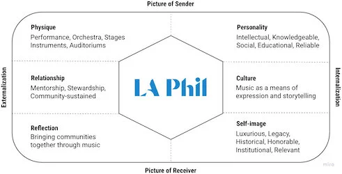
Brand Analysis
The first step was to conduct an analysis of the organization’s current digital presence, to understand its values, voice and personality across platforms. A brand identity prism was compiled, highlighting the LA Phil’s core values and principles.
Outside Research
Prior research conducted by the LA Phil showed that current concert goers all shared the same deep appreciation of the history, structure and beauty of the music being performed.
We found that millennials had the same appreciation of the arts as the LA Phil’s current concert goers, and deeply value education, experiences and expanding their horizons, or “The 3 Es.”

Competitive & Comparative Analysis
We considered top national musical organizations for our analysis of direct competition, and decided on the Los Angeles Chamber Orchestra and the California Symphony. For indirect competition, we approached for analysis and decided on several museums, as they occupy the same space on one’s schedule as the LA Phil: an intellectual, recreational pursuit.

Interviews
A screener survey was sent out to recruit interview participants ages 22-38 (millennials) with an interest in the arts. The survey population was expanded to find participants with eclectic taste in music outside of classical as well as those with interest in museums. Interviews revealed frustrations, preconceptions and sentiments around arts-related events, and told us our users were far more likely to use a desktop device when researching new information. This gave us a clear direction to take our solution, as new users would be far less likely to download an app in their research of the LA Phil.

Affinity Mapping
Arranging interview insights into similar groupings made it clear that prohibitive pricing and lack of clear information were the main blockers for users attending events or purchasing tickets. Most interviewees participated in arts-related activities with friends and had more experience visiting museums than attending concerts, which validated our C&C analysis. Groupings of insights were headed with direct “I” statements to keep focus on the user.

User Persona
All of these insights showed us our user’s goals, needs, frustrations and pain points as well as demographics, habits, hobbies and feelings. This led us to develop our target user persona, Makenna. We could now focus our efforts on making the experience as Makenna-friendly as possible.

Journey Map
Makenna’s best friend from home just texted about how excited they are to see her in two weeks. With work being so busy, she had forgotten all about their visit. What will they do? She hops on her laptop and searches, “Best experiences in Los Angeles,” and sees the LA Phil at Walt Disney Concert Hall. She’s heard of the LA Philharmonic but has never been to a show before. She decides to check out the website and see if the LA Phil is the right experience for her and her friend.
Makenna felt good at the beginning and end of task, but was less hopeful during the middle and grew frustrated at the lack of relevant information, became overwhelmed by the unclear navigation. She spent more time than necessary completing assigned tasks.

Problem & Hypothesis
We came together to develop a concise, articulate problem statement based on Makenna and her story:
Makenna needs a better way to search for concerts to attend because she is overwhelmed with an unfamiliar process and is not confident in making a decision.
This was followed by to two direct, brief How Might We statements:
How might we familiarize Makenna with the LA Phil and its offerings?
How might we give Makenna the information she needs to feel confident?
These statements would direct the team’s next step and develop a hypothesis that would be used to validate decisions made during the next stage of our process:
We believe that through a streamlined digital platform that gives context to newcomers, we will allow Makenna to feel confident in her decision to attend the LA Phil.
Ideate & Design
Features
Since Makenna spends more than half of her online time on a laptop, a desktop site was the most appropriate solution. New content such as a section for “First Timers” would direct Makenna’s flow and provide information to introduce her to the organization and its offerings. Additionally, A view of the stage from selected seats would allow Makenna to understand the space and feel more informed before making to a purchase, and a concert-matching feature would curate results and make the process more familiar and comfortable.

Card Sorting & Sitemap
A new sitemap was needed to clarify Makenna’s flow through the site, so a series of open and closed card sorts were conducted using the 29 categories of the current site’s navigation. A revised sitemap was developed, combining repeated and similar categories as well as relabeling those that lacked clarity for Makenna.


Wireframes
Through design studio and brainstorming sessions, we established our design, processes and deliverables, keeping Makenna in mind as well as insights from earlier processes. Sketches were refined by the design lead and decisions the team made were implemented into a medium-fidelity, grayscale prototype.

Test & Iterate
Usability Testing
A plan was developed to test our prototype, and users were recruited for the process. Participants were given the same scenario as Makenna while navigating the site, and asked to complete the following task:
“As someone new to the LA Phil, show me how you would find a show based on your tastes and complete the checkout process.”
To our surprise, no users selected the option of “First Timers” from the navigation as the first step, and most users didn’t notice the additional content on the final confirmation page. Results were compiled with takeaways and next steps written for implementation in a final, high-fidelity mockup.

High-fidelity Mock-up
A fully fleshed-out mockup was developed by the design lead based on medium-fidelity iterations with amendments made in accordance with usability test results. Images were sourced from the LA Phil’s and edited and to fit a new subdued and sophisticated aesthetic, and an interactive concert-matcher would curate specific results using familiar points of reference.


Tangible information for Makenna, including FAQ, social events, recommendations and an embedded Spotify player, were added to the Event Details page. A photo view of the stage from selected seats was also added to help Makenna feel confident in her decision and establish a physical connection with the space.


Promotion of the LA Phil app and rewards for attending were added to the Purchase Confirmation page, allowing Makenna to feel good about her experience even after leaving the site.

Prototype

Reflection
Next Steps

Conducting more user interviews would establish a more robust persona and pain points.
Comparative analysis on movie theaters would give us insight into ticketing, seat selection and rewards programs.
Develop and test a native mobile app with tangible options for learning experiences before, during, and after performances.
Focus on cultivating a narrative throughout social media to create an intimate online space. Outreach in the form of live streams or Q&A on popular platforms.
What I Learned
Our team initially envisioned the solution as a mobile site or app. We were surprised when research and interviews indicated our users were far more likely to use a desktop or laptop computer to access and research new information. It was a great exercise in keeping personal bias out of the process and focusing on our users and their needs.